In this exercise set, we will be looking at fairness.
We first look at fairness with models, focusing first on how to examine a model in relation to fairness criteria (assesment), and then how to post-process a model to make it more fair according to a specific criteria (mitigation).
After this we look at admission to Berkeley, a classic example demonstrating a fairness analysis with only historical data and no model.
Fairness with models
In this exercise we will utilize the same dataset as in session 4, Supervised Learning, but this time we will be using the full dataset. The dataset is about classification of high income people, namely the Census Income Data Set from the UCI Machine Learning Repository.
A large part of these exercises will be dedicated to getting familiar with fairlearn, which is a package that makes working with fair machine learning easier. In addition to documenting their code, they also have a large amount of examples and text regarding fairness in machine learning in their User Guide.
Exercise 1.1
Based on the code below, what is \(Y, X, A\) using the terminology from the lecture? Is \(A\) part of \(X\), which we will build our model on? If yes, is this required?
# Load packagesimport numpy as npimport pandas as pdimport matplotlib.pyplot as pltfrom fairlearn.datasets import fetch_adult# Load datadata = fetch_adult(as_frame=True)X = pd.get_dummies(data.data)y_true = (data.target =='>50K') *1sex = data.data['sex']# Print data descriptionprint(data.DESCR)
**Author**: Ronny Kohavi and Barry Becker
**Source**: [UCI](https://archive.ics.uci.edu/ml/datasets/Adult) - 1996
**Please cite**: Ron Kohavi, "Scaling Up the Accuracy of Naive-Bayes Classifiers: a Decision-Tree Hybrid", Proceedings of the Second International Conference on Knowledge Discovery and Data Mining, 1996

Prediction task is to determine whether a person makes over 50K a year. Extraction was done by Barry Becker from the 1994 Census database. A set of reasonably clean records was extracted using the following conditions: ((AAGE>16) && (AGI>100) && (AFNLWGT>1)&& (HRSWK>0))

This is the original version from the UCI repository, with training and test sets merged.

### Variable description

Variables are all self-explanatory except __fnlwgt__. This is a proxy for the demographic background of the people: "People with similar demographic characteristics should have similar weights". This similarity-statement is not transferable across the 51 different states.

Description from the donor of the database:

The weights on the CPS files are controlled to independent estimates of the civilian noninstitutional population of the US.  These are prepared monthly for us by Population Division here at the Census Bureau. We use 3 sets of controls. These are:
1.  A single cell estimate of the population 16+ for each state.
2.  Controls for Hispanic Origin by age and sex.
3.  Controls by Race, age and sex.

We use all three sets of controls in our weighting program and "rake" through them 6 times so that by the end we come back to all the controls we used. The term estimate refers to population totals derived from CPS by creating "weighted tallies" of any specified socio-economic characteristics of the population. People with similar demographic characteristics should have similar weights. There is one important caveat to remember about this statement. That is that since the CPS sample is actually a collection of 51 state samples, each with its own probability of selection, the statement only applies within state.


### Relevant papers

Ronny Kohavi and Barry Becker. Data Mining and Visualization, Silicon Graphics.
e-mail: ronnyk '@' live.com for questions.

Downloaded from openml.org.
print('Target value counts')print(y_true.value_counts())print()print('Sex value counts')print(sex.value_counts())
Target value counts
0    37155
1    11687
Name: class, dtype: int64

Sex value counts
Male      32650
Female    16192
Name: sex, dtype: int64
### BEGIN SOLUTION# X = X, including information such as income, race, sex, age, education, etc.# Y = y_true, an indicator indicating income higher than 50K# A = sex, the sex of the observation# A is part of X. This is not required, but is in general beneficical if one wants to achieve sufficency.### END SOLUTION
Exercise 1.2
We will first create a model to analyze. Create a Decision Tree Classifier with max_depth=5 and min_samples_split=50 and fit it on the data. On the basis of this model, predict the outcomes for the same data.
### BEGIN SOLUTIONfrom sklearn.tree import DecisionTreeClassifierclassifier = DecisionTreeClassifier(max_depth=5, min_samples_split=50)classifier.fit(X, y_true)y_pred = classifier.predict(X)### END SOLUTION
A large part of fairness assesment is looking at metrics across sensitive features. To aid in this, fairlearn has a concept which is called a MetricFrame, which aids in this.
We will start with perhaps the most basic fairness assesment, looking at performance differences across a metric.
Exercise 1.3
Create a MetricFrame with the metric accuracy_score you know from sklearn.metrics >Hints: > > The API Docs are available online and support searching! > > Creating the MetricFrame itself won’t return any output
### BEGIN SOLUTIONfrom sklearn.metrics import accuracy_scorefrom fairlearn.metrics import MetricFramemf = MetricFrame(metrics=accuracy_score, y_true=y_true, y_pred=y_pred, sensitive_features=sex)### END SOLUTION
Assesment
It’s nice to work with the MetricFrame because it lets us look at performance across the sensitive attribute quickly.
Exercise 1.4
Report the overall accuracy and accuracy by group. Does the model perform equally well across sex?
Hints:
The API Docs are available online and support searching!
The MetricFrame has some useful methods
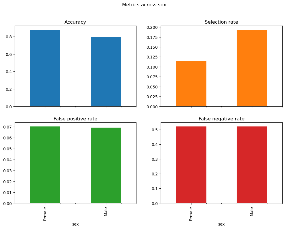
mf.overall
0.8527087342860653
mf.by_group
sex
Female    0.926630
Male      0.816049
Name: accuracy_score, dtype: float64
Having now looked at accuracy across sex, we want to move closer to the fairness criteria independence and separation.
Exercise 1.5
In addition to the accuracy score, you should now also include the selection rate, false positive rate and false negative rate in your MetricFrame. Report them overall and across sex.
Does the model satisfy independence, separation or both? Was this expected?
Hints:
The API Docs are available online and support searching!
You can input a dictionary where the keys are names and the values are metrics to the MetricFrame
All three metrics are available in fairlearn.metrics
### BEGIN SOLUTIONfrom fairlearn.metrics import false_positive_rate, false_negative_rate , selection_ratemetrics = {"Accuracy": accuracy_score,"Selection rate": selection_rate,"False positive rate": false_positive_rate,"False negative rate": false_negative_rate,}mf_multiple = MetricFrame( metrics=metrics, y_true=y_true, y_pred=y_pred, sensitive_features=sex)print(mf_multiple.overall)print(mf_multiple.by_group)# Does not satisfy independence (equal selection rates) nor separation (equal false positive rate and false negative rate). # This is as expected as A is part of X, and thus the model almost certainly obtains sufficiency, and thus generally not independence nor separation.### END SOLUTION
When reporting multiple metrics, it can sometimes become hard to maintain an overview of the differences and ratios across the sensitive attribute, but luckily MetricFrame can help us with this.
Exercise 1.5
Report the absolute differences and ratios across sex across the sensitive feature.
Hints:
The API Docs are available online and support searching!
However, many people find figures nicer to look at than numbers. Let’s create one!
Exercise 1.6
Create a bar plot of the different metrics across sex.
Hints:
The API Docs are available online and support searching!
The MetricFrame.by_group is a DataFrame, which means it support bar plots through plot.bar.
To achieve a nicer bar plot, you can try changing the following keywords: subplots, layout, legend, figsize and title
### BEGIN SOLUTIONmf_multiple.by_group.plot.bar( subplots=True, layout=[2, 2], legend=False, figsize=[12, 8], title="Metrics across sex")plt.show()### END SOLUTION
Post-process the classifier we have created to satisfy demographic parity whilst optimizing accuracy.
Hints:
The API Docs are available online and support searching!
The fairlearn follows the sklearn syntax with .fit and .predict
### BEGIN SOLUTIONfrom fairlearn.postprocessing import ThresholdOptimizerpostprocess_est = ThresholdOptimizer( estimator=classifier, constraints="demographic_parity", objective="accuracy_score")postprocess_est.fit(X, y_true, sensitive_features=sex)### END SOLUTION
c:\Users\wkg579\.conda\envs\vive_env\lib\site-packages\fairlearn\postprocessing\_threshold_optimizer.py:285: FutureWarning: 'predict_method' default value is changed from 'predict' to 'auto'. Explicitly pass `predict_method='predict' to replicate the old behavior, or pass `predict_method='auto' or other valid values to silence this warning.
  warn(
In a Jupyter environment, please rerun this cell to show the HTML representation or trust the notebook. On GitHub, the HTML representation is unable to render, please try loading this page with nbviewer.org.
Examine the metrics of the post-processed classifier. Does it satisfy independence, and at what selection rate? Has it influenced any of the other metrics? Why is this?
Hints:
The API Docs are available online and support searching!
Use any method of vizualising metrics across groups that you like
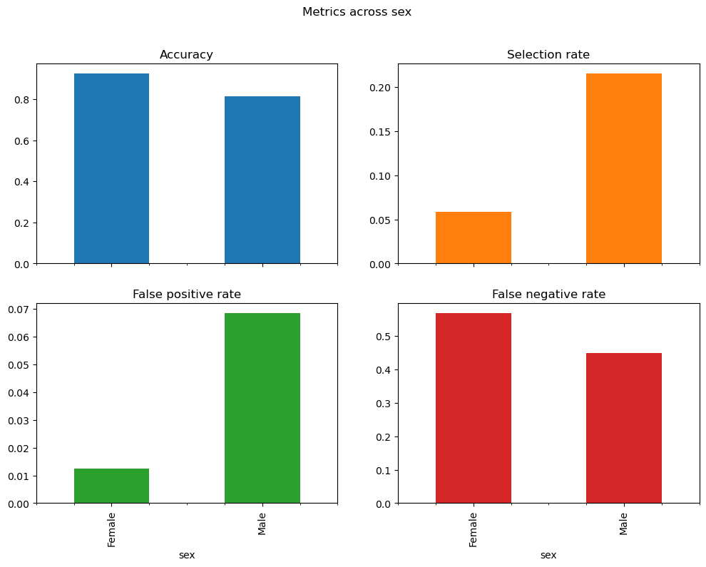
### BEGIN SOLUTIONy_pred_demographic_parity = postprocess_est.predict(X, sensitive_features=sex)metric_frame_demographic_parity = MetricFrame( metrics=metrics, y_true=y_true, y_pred=y_pred_demographic_parity, sensitive_features=sex)print('Original classifier')print(mf_multiple.by_group)print('Post-processed classifier')print(metric_frame_demographic_parity.by_group)metric_frame_demographic_parity.by_group.plot.bar( subplots=True, layout=[2, 2], legend=False, figsize=[12, 8], title="Metrics across sex",)plt.show()# The model satisfies selection rate at around 21%, which is the original male selection rate# This has been achieved by increasing the amount of selected females# However, this has also significantly increased the false positive rate for the females, due to higher acceptance# No free lunch!### END SOLUTION
Original classifier
        Accuracy  Selection rate  False positive rate  False negative rate
sex
Female  0.926630        0.058239             0.012549             0.569248
Male    0.816049        0.215191             0.068494             0.448578
Post-processed classifier
        Accuracy  Selection rate  False positive rate  False negative rate
sex
Female  0.789402        0.221900             0.181446             0.448276
Male    0.804074        0.212956             0.075488             0.471970
Exercise 1.7
Repeat the two previous exercises, but now satisfying separation.
Hints:
The API Docs are available online and support searching!
separation is also sometimes known as equalized odds.
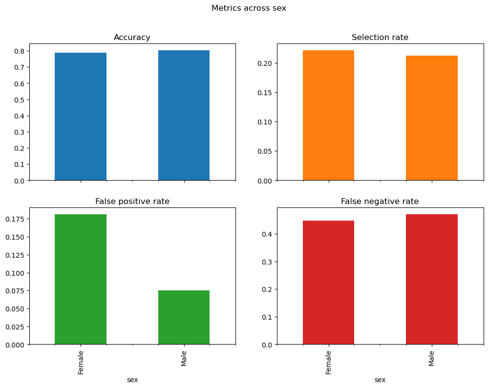
### BEGIN SOLUTIONpostprocess_est_equal_odds = ThresholdOptimizer( estimator=classifier, constraints="equalized_odds", objective="accuracy_score")postprocess_est_equal_odds.fit(X, y_true, sensitive_features=sex)y_pred_equalized_odds= postprocess_est_equal_odds.predict(X, sensitive_features=sex)metric_frame_equalized_odds = MetricFrame( metrics=metrics, y_true=y_true, y_pred=y_pred_equalized_odds, sensitive_features=sex)print('Original classifier')print(mf_multiple.by_group)print('Post-processed classifier')print(metric_frame_equalized_odds.by_group)metric_frame_equalized_odds.by_group.plot.bar( subplots=True, layout=[2, 2], legend=False, figsize=[12, 8], title="Metrics across sex",)plt.show()# The model satisfies separation by increasing the false positive rate for females to one equal that of males,# but has both increased and decreased false negative rates to a middle ground# This is due to the fact that we examine all classifiers that satisfy separation, and choose the one that maximizes the # accuracy score, and this performed the best. ### END SOLUTION
c:\Users\wkg579\.conda\envs\vive_env\lib\site-packages\fairlearn\postprocessing\_threshold_optimizer.py:285: FutureWarning: 'predict_method' default value is changed from 'predict' to 'auto'. Explicitly pass `predict_method='predict' to replicate the old behavior, or pass `predict_method='auto' or other valid values to silence this warning.
  warn(
Original classifier
        Accuracy  Selection rate  False positive rate  False negative rate
sex
Female  0.926630        0.058239             0.012549             0.569248
Male    0.816049        0.215191             0.068494             0.448578
Post-processed classifier
        Accuracy  Selection rate  False positive rate  False negative rate
sex
Female  0.880373        0.114872             0.070304             0.521764
Male    0.793691        0.193691             0.069110             0.520770
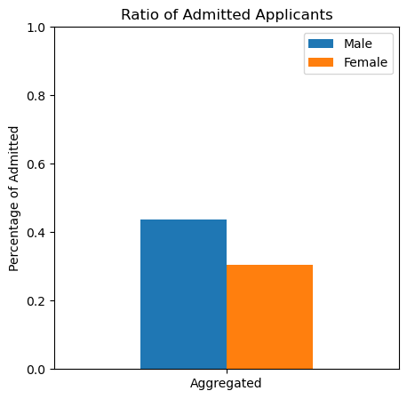
Sometimes you do not have access to the full modelling process, and merely have observed outcomes. A such example is given the Berkeley_Admissions_Data.csv dataset, which is a three-way table that presents admissions data at the University of California, Berkeley in 1973 according to the variables department (A, B, C, D, E, F), gender (male, female), and outcome (admitted, denied) encoded as Yes and No. In this case, we can still assess fairness in some ways.
Focusing on Berkeley overall, did their admissions suffer from gender bias?
Hints: > Subset the row pertaining to all departments > > What fairness metrics can you calculate with the given information? > > The code snippet df["new_col"] = df.apply(lambda x: x["col1"] + x["col2"], axis = 1) creates a new column called new_col which is adds together x["col1"] + x["col2"], which can also be used in combinations with other common operators such as /, - and *. There’s an example in exercise 2.3 and code for a plot > >
### BEGIN SOLUTION# Calculate selection ratedf["m_share"] = df.apply(lambda x: x["Male Yes"]/ (x["Male No"] + x["Male Yes"]), axis =1)df["f_share"] = df.apply(lambda x: x["Female Yes"]/ (x["Female No"] + x["Female Yes"]), axis =1)# Plotfig, ax = plt.subplots(1,1, figsize=(5,5))ax = df[["Dept","m_share", "f_share"]][df["Dept"] =="All"].plot.bar(ax=ax, title="Ratio of Admitted Applicants", rot=0, ylabel="Percentage of Admitted", ylim=[0,1])ax.set_xticklabels(["Aggregated"])ax.legend(["Male", "Female"])plt.show()# Looking at the selection rate, we observe indications of discrimination against women, who have a lower selection rate than men. # As such, independence is not satisfied### END SOLUTION
Exercise 2.3
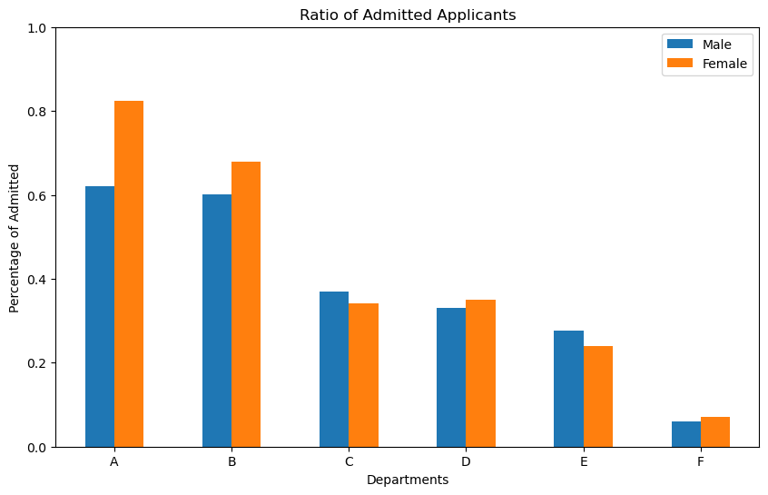
Now perform a similar analysis within each department. Do you maintain your conclusion from exercise 2.2?
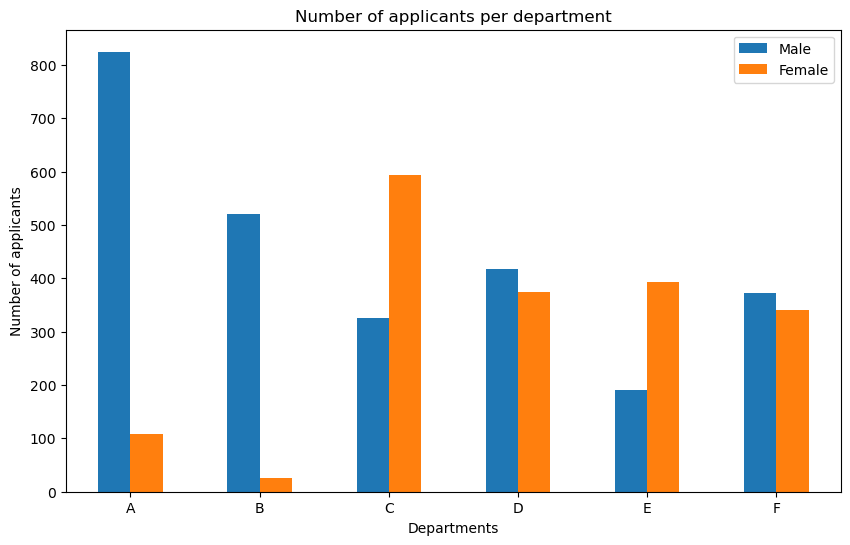
Hints: > Subsets the rows pertaining to each of the department > > The code beneath creates a plot with amount of applicants per department. Perhaps this code could be amended to create other plots, or aid in a discussion. > > Do you find any evidence of Simpson’s paradox?
# Calculate amountdf["M_num"] = df.apply(lambda x: x["Male Yes"] + x["Male No"], axis =1)df["F_num"] = df.apply(lambda x: x["Female Yes"] + x["Female No"], axis =1)# Barplot for first six rows (.iloc[0:6])fig, ax = plt.subplots(figsize=(10,6))df[["M_num", "F_num"]].iloc[0:6].plot.bar(title="Number of applicants per department", rot=0, ylabel="Number of applicants", xlabel="Departments", ax=ax)ax.set_xticklabels(["A", "B", "C", "D", "E", "F"])ax.legend(["Male", "Female"])plt.show()
### BEGIN SOLUTIONfig, ax = plt.subplots(1,1, figsize=(10,6))ax = df[["Dept","m_share", "f_share"]].iloc[0:6].plot.bar(ax=ax, title="Ratio of Admitted Applicants", rot=0, ylabel="Percentage of Admitted", xlabel="Departments", ylim=[0,1])ax.set_xticklabels(df["Dept"][0:6])ax.legend(["Male", "Female"])plt.show()# Looking at the selection ratio within each department, we see that the general trend observed in the aggregated form disappears# Some departments exhibit similar acceptance rates for women and men, some department accept more women than men, while some departments accept slightly more men than women.# Combining this with the figure regading where the different sexes apply, we observe that females were more like to apply to deparments with low acceptance ratios (supposedly more competitive departments)# These differences in application behaviour explains the apparent gender bias in the aggregated plot. # Thus, we can argue that there is no discrimination based on gender# This is a classic example of Simpson's Paradox, where different levels of aggregation leads to contradicting conclusions### END SOLUTION